
New website is more effective – and mobile responsive

One of Wichita’s universities just got a new facelift – online.
Newman University launched a new, more effective and mobile-friendly website on July 1, 2015. The project began in September 2014. Design and development duties for the new site were performed in-house by former Digital Communications Specialist Anthony D’Alessio and Web Technology Specialist Daniel Murphy, with the help of student workers in the University Relations Department.
Major goals of the project included increasing viewers’ average time on the site, reducing the “bounce rate” (people who visit, then leave) and, most importantly, making the site mobile responsive so it can be viewed and operated easily on tablets, cell phones and
other mobile devices.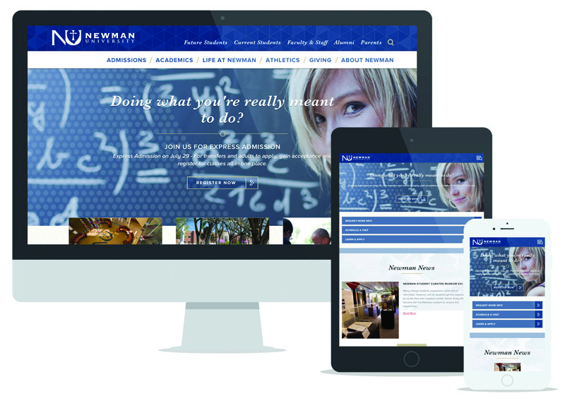
The mobile design of the menu alone required one full month of design, redesign and more redesign before it was finally implemented.
In the first few weeks of the site going live, it generated many positive statistics, including a 50 percent decrease in page-load speed, an 80 percent increase in average time on the site, and a 50 percent decrease in the bounce rate.
Visit the new Newman University website at newmanu.edu.